





- سلة التسوق فارغة تصفح المتجر
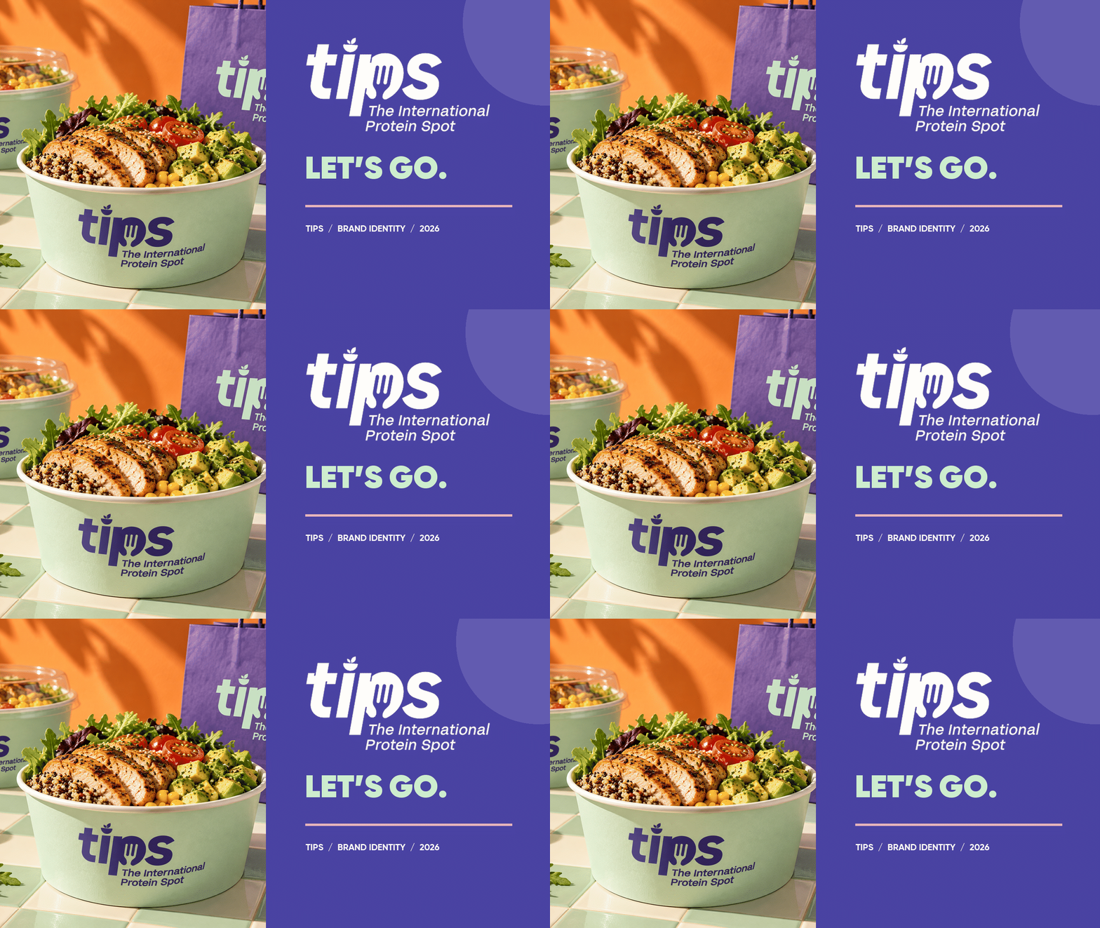
TIPS Brand Identity
Project Overview
TIPS — The International Protein Spot is a healthy food brand built around fresh ingredients, protein-rich meals, and a vibrant approach to everyday eating. The project brings this character to life through a coordinated visual identity, meal packaging, and product imagery.
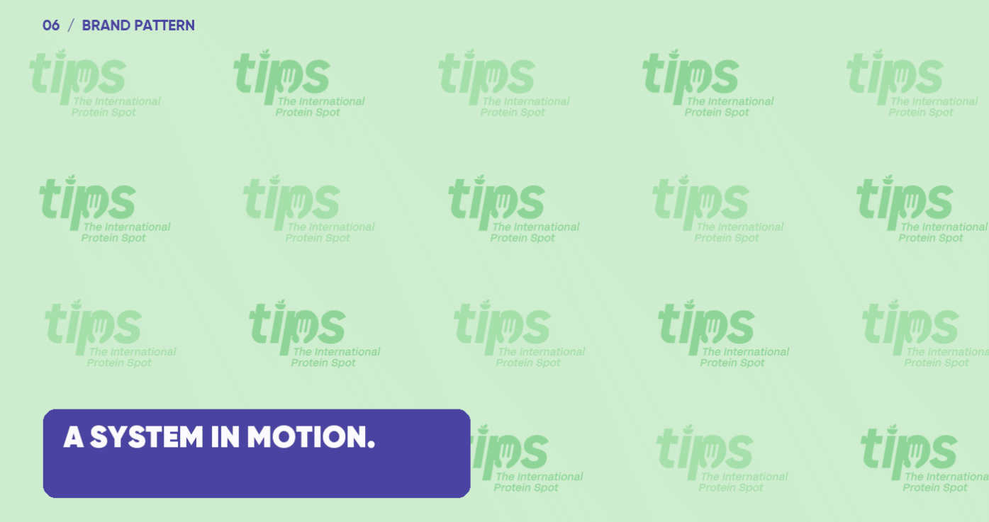
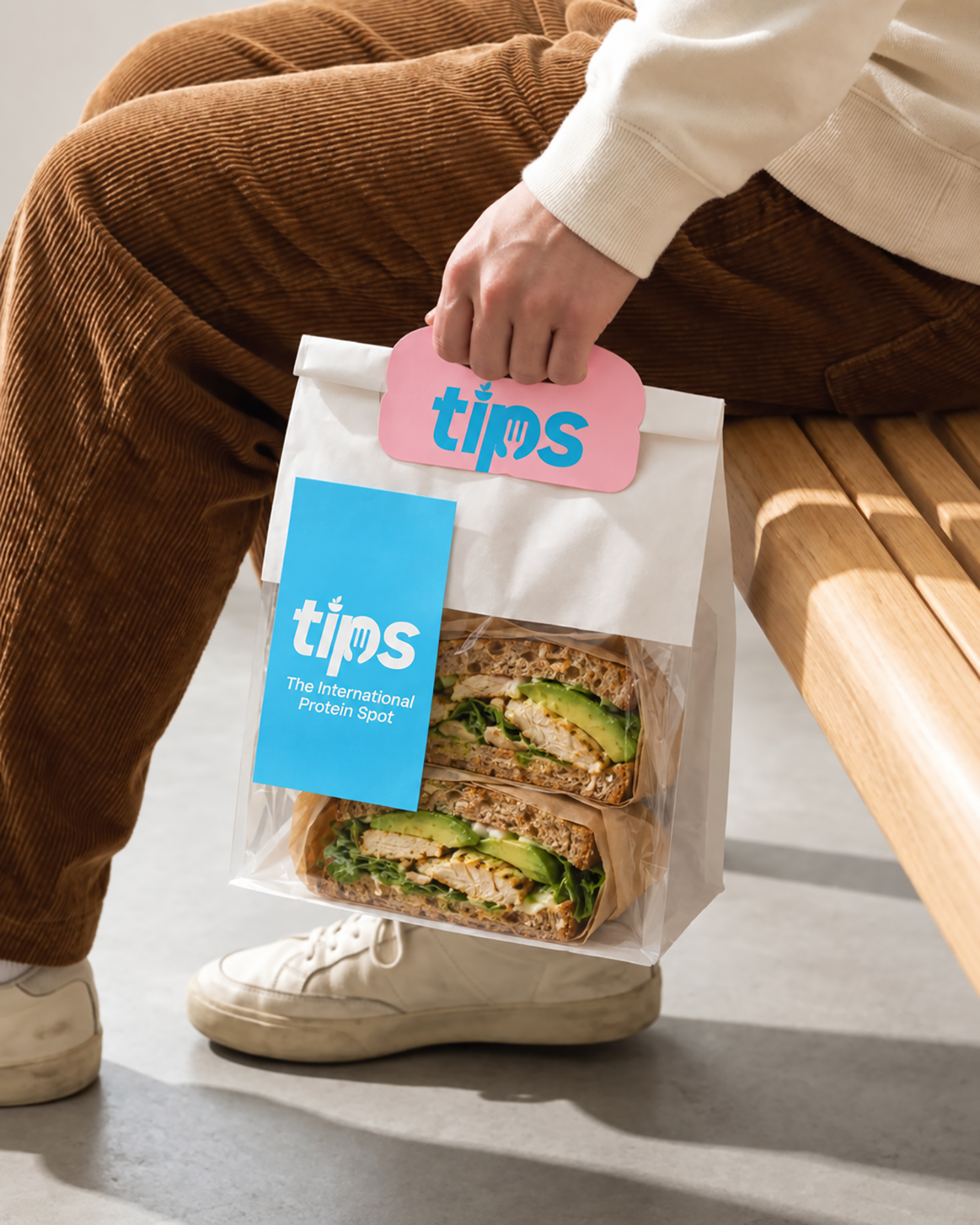
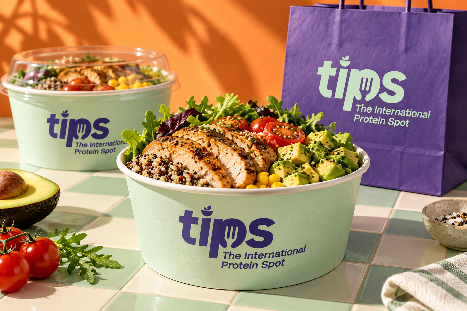
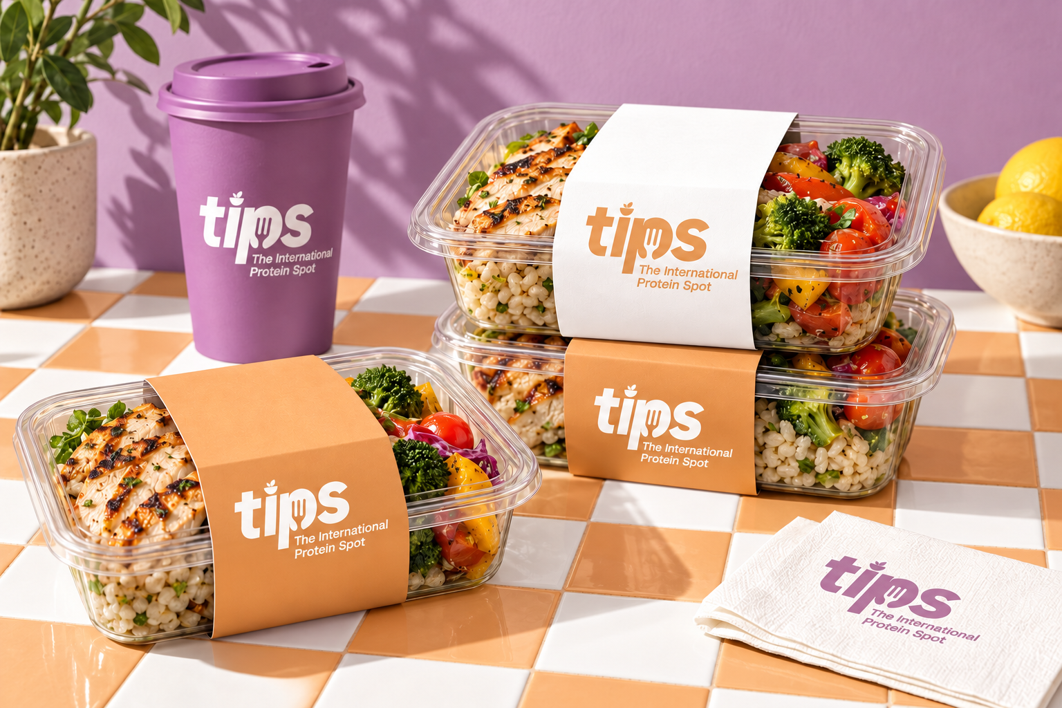
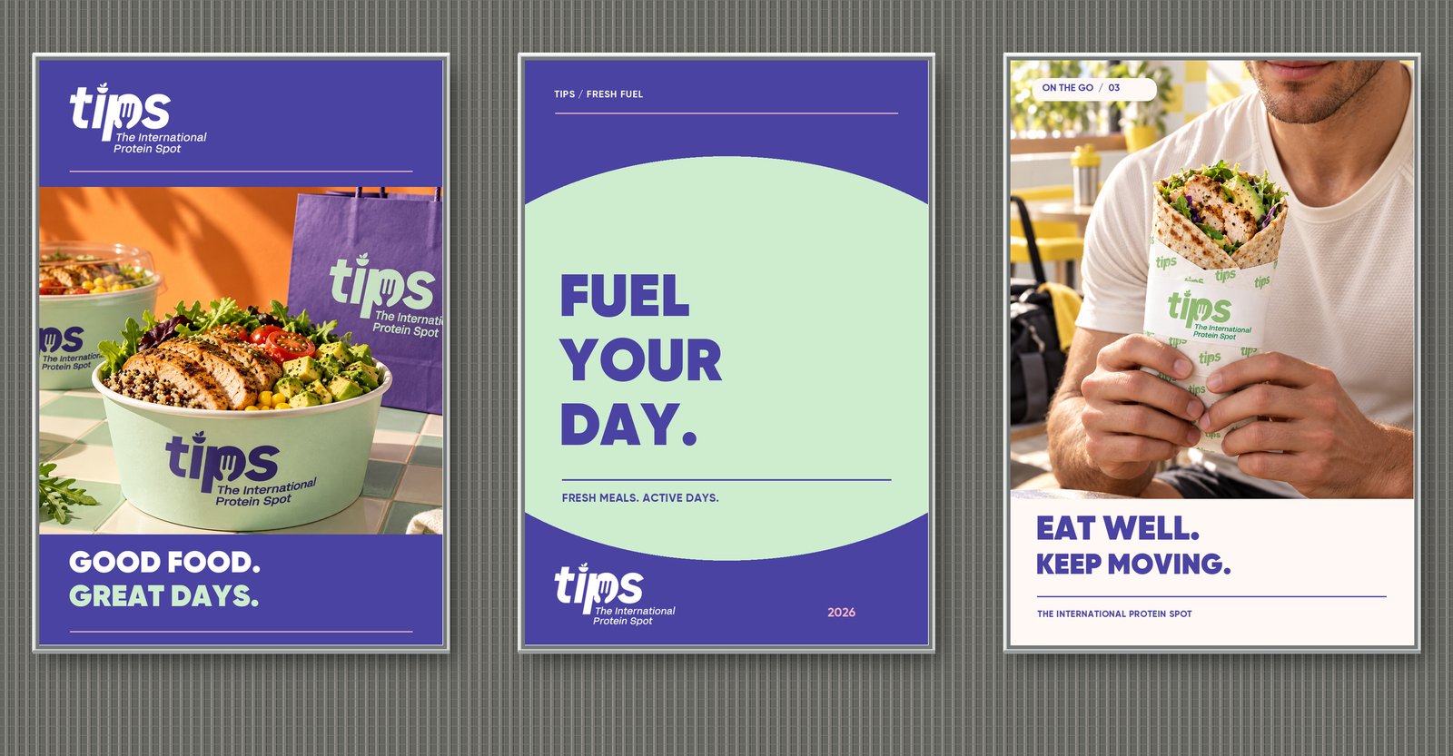
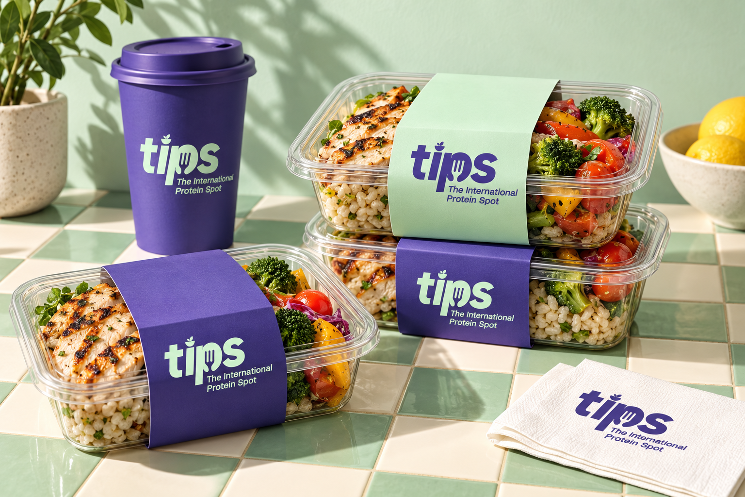
The creative direction pairs a distinctive lowercase wordmark with an expressive color palette. Purple, pink, orange, and light blue establish a playful, contemporary personality, giving the brand a recognizable presence across its packaging and visual communications.
Visual Identity & Packaging
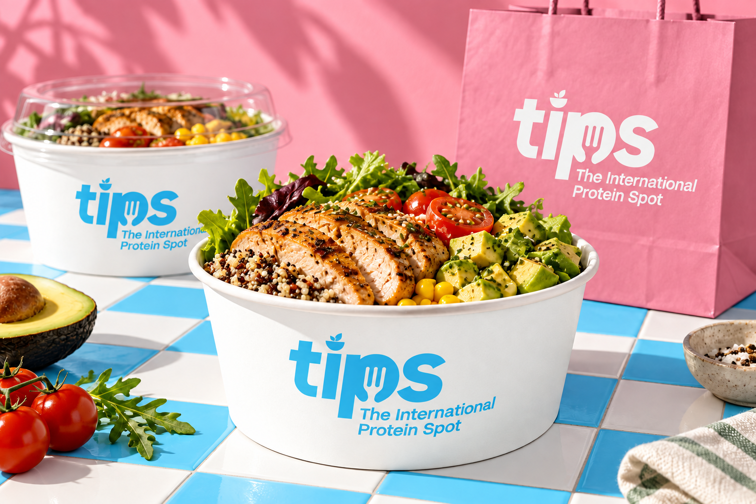
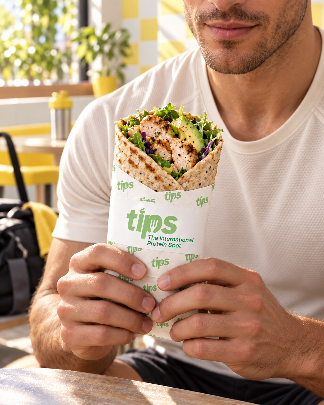
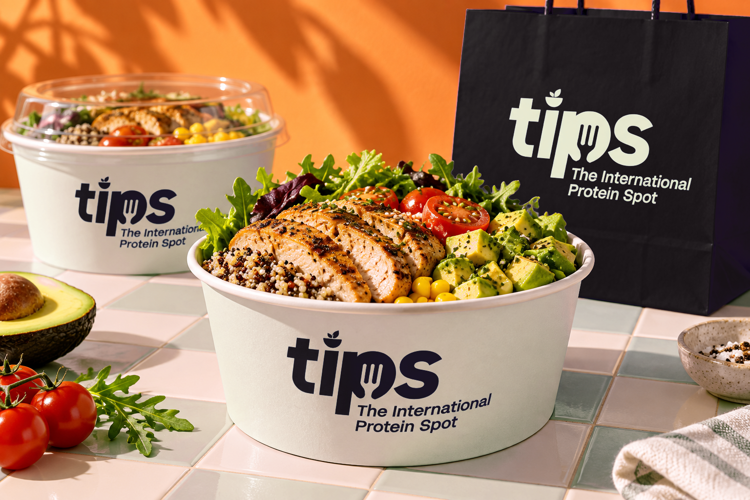
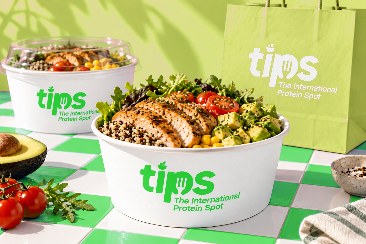
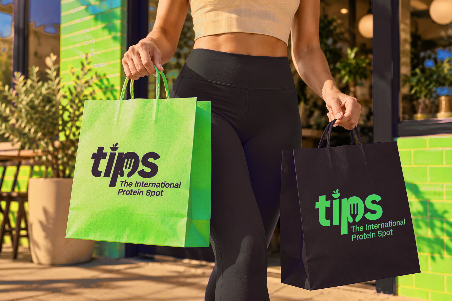
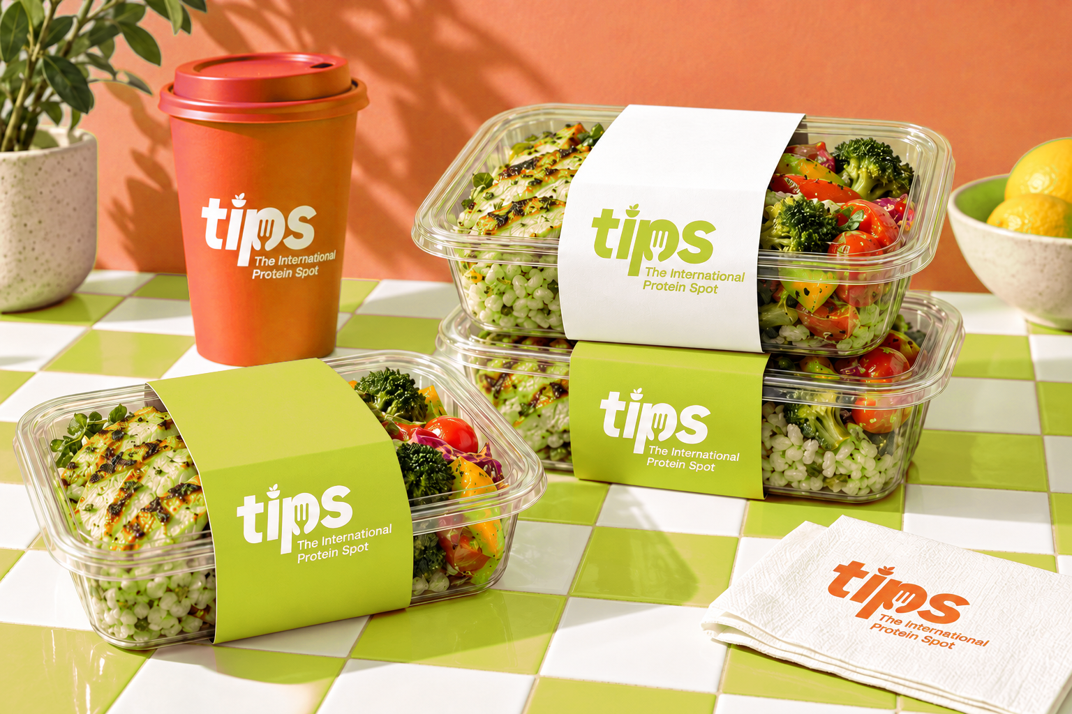
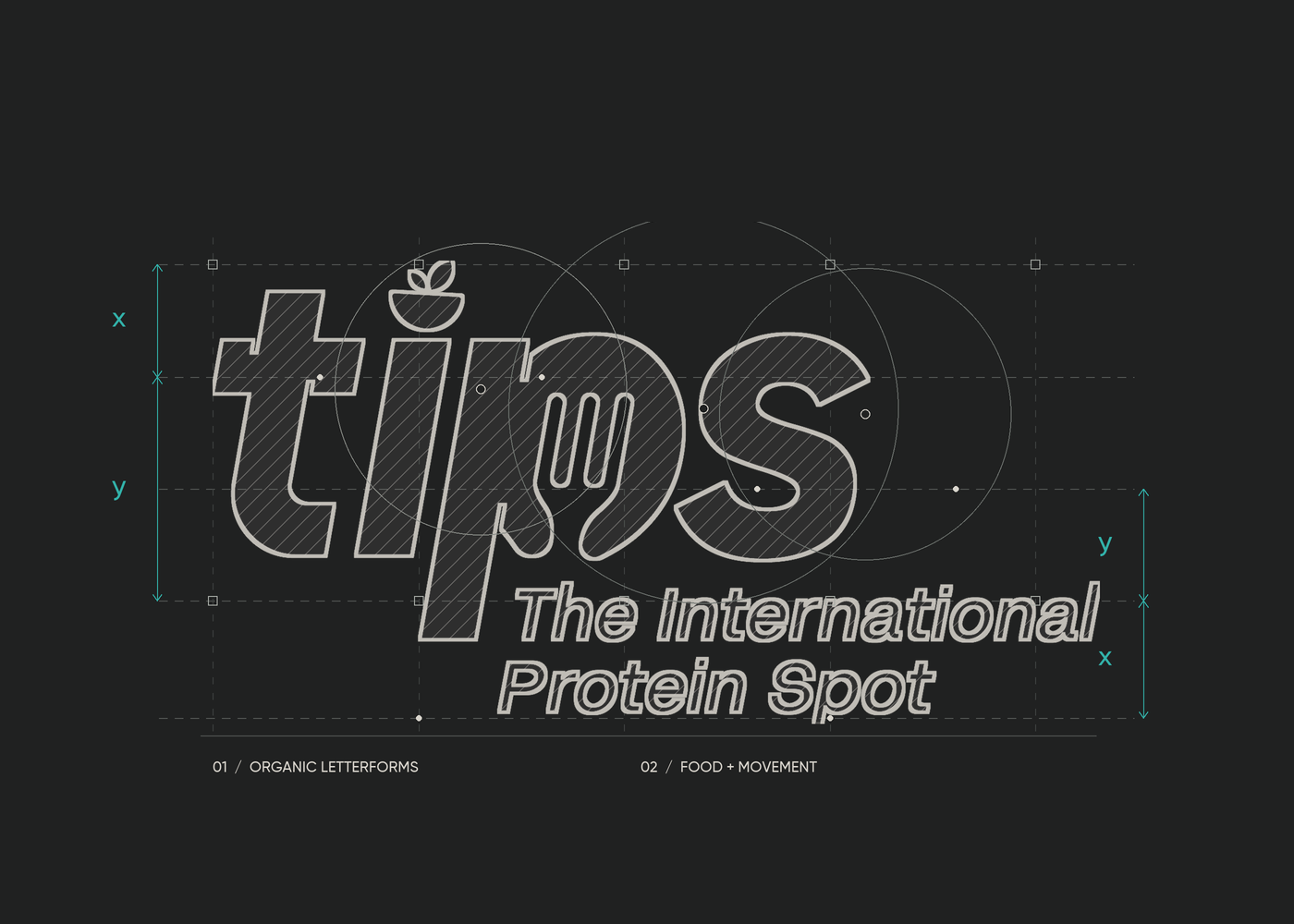
The TIPS wordmark incorporates food-inspired details, connecting the identity to its category while keeping the brand name at the center of the design. White logo applications create a consistent point of recognition against the colorful packaging sleeves.
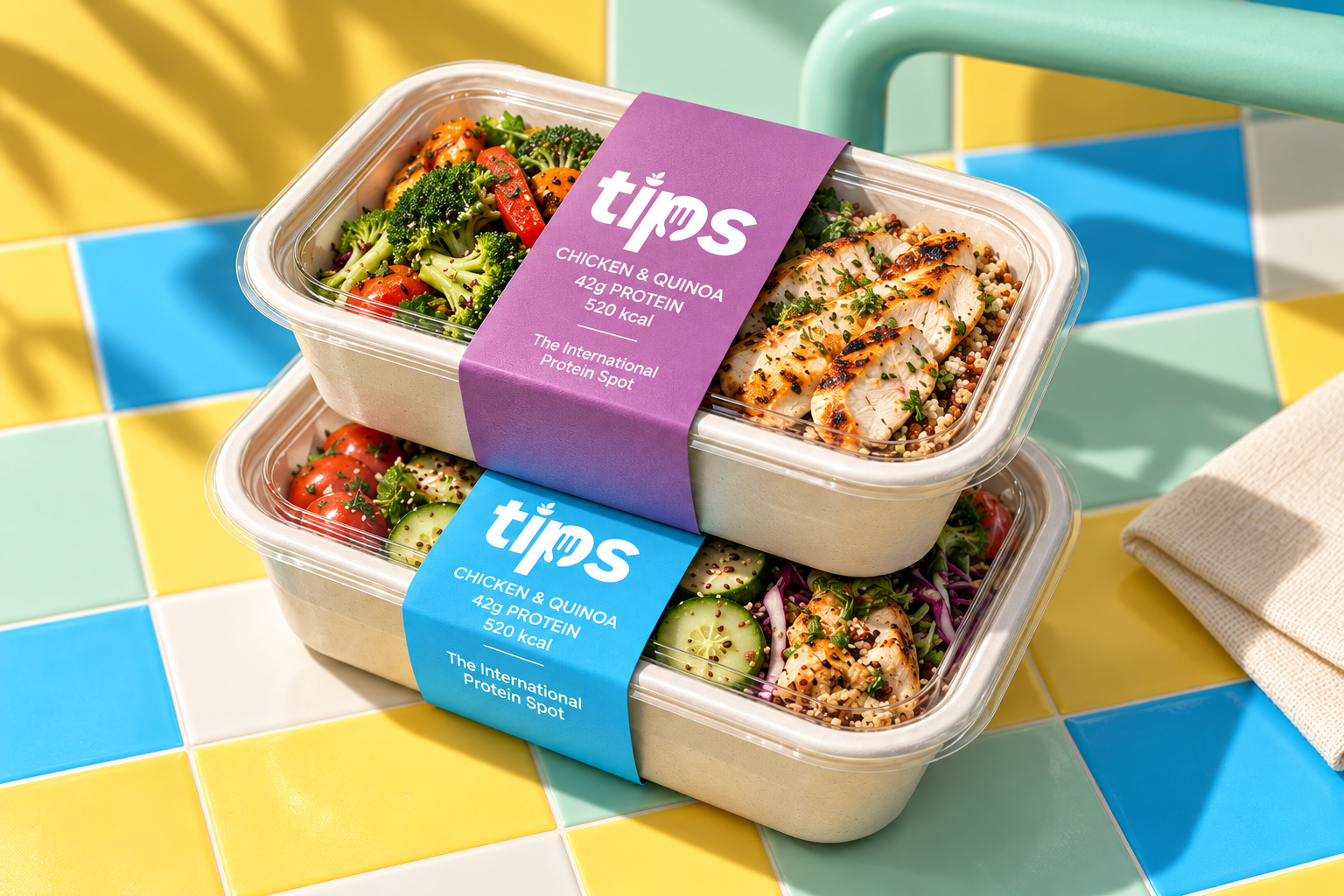
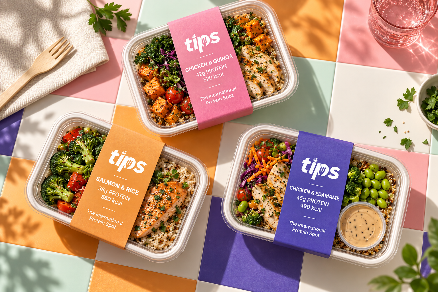
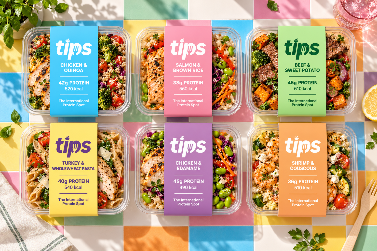
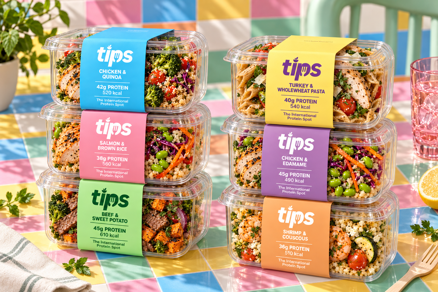
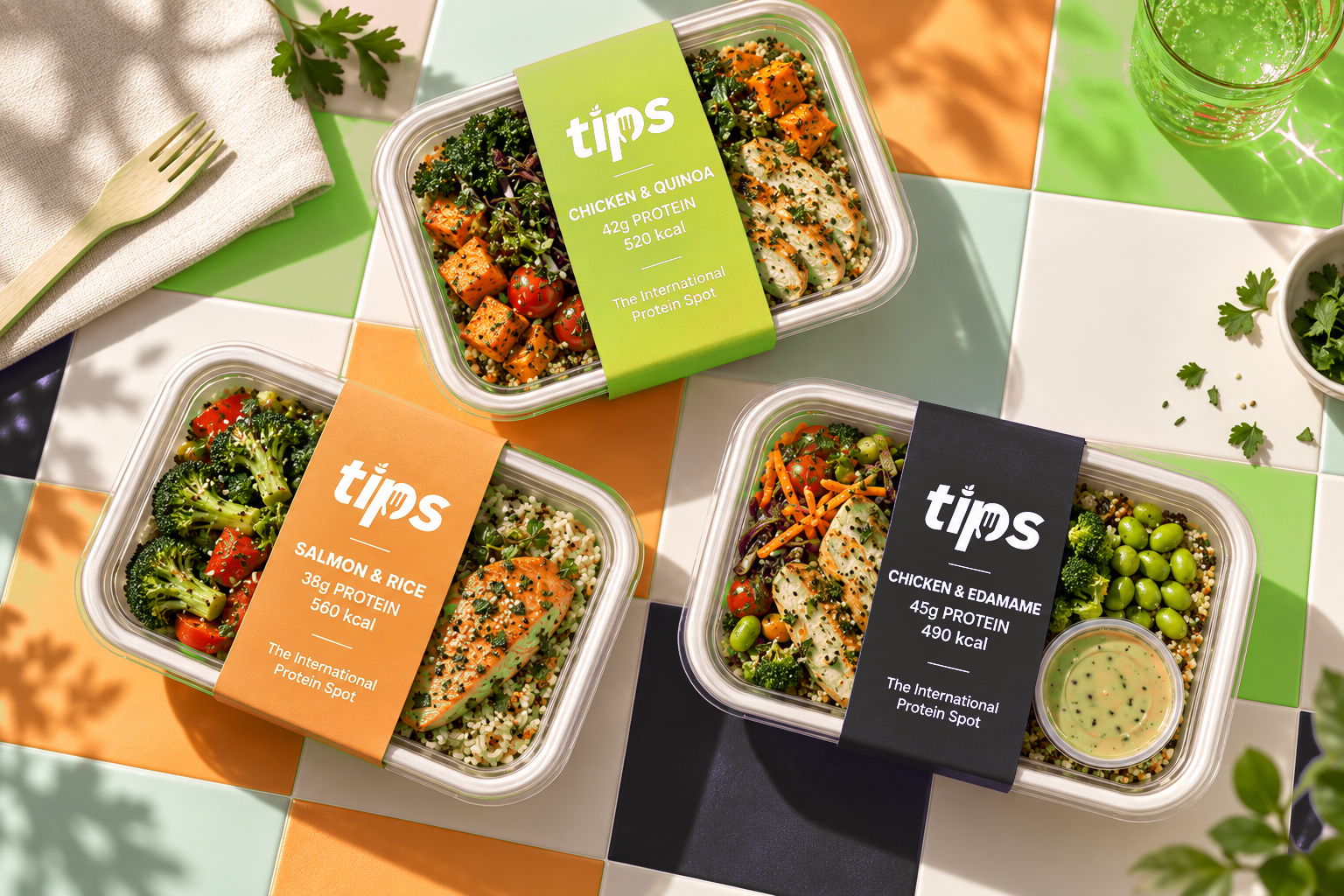
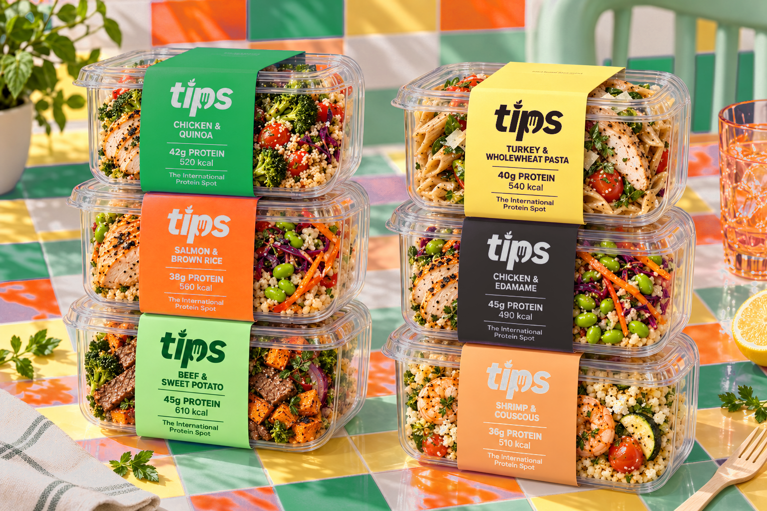
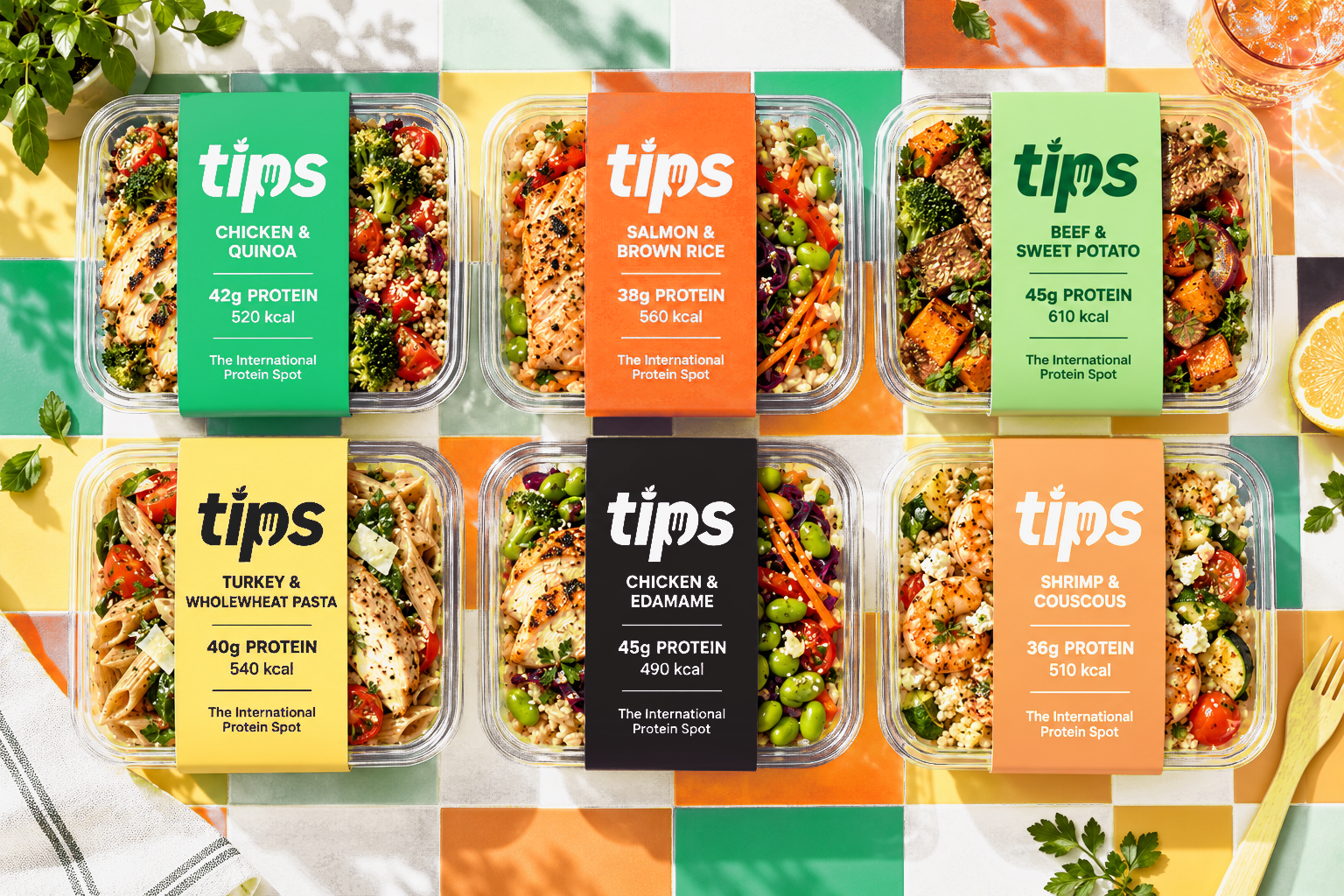
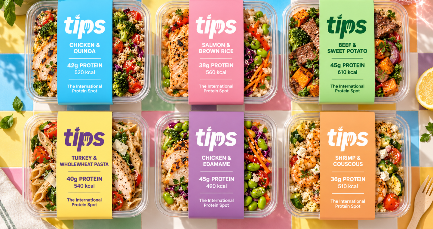
The packaging system combines transparent meal containers with wraparound paper sleeves, keeping the ingredients visible while providing a clear space for essential information. Each sleeve follows a consistent hierarchy: the TIPS logo at the top, the meal name and nutritional information in the middle, and “The International Protein Spot” below.
Across the six meal packaging concepts, individual colors distinguish the products while a shared layout holds the collection together. This approach allows different meals to retain their own character within one recognizable brand family.
Art Direction & Applications
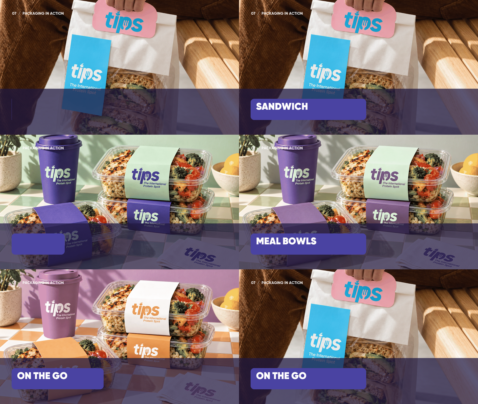
The product imagery extends the identity through overhead arrangements and stacked packaging compositions. Colorful surfaces, fresh ingredients, and warm directional lighting create an inviting setting that connects the packaging to the food inside.
The featured composition presents Chicken & Quinoa, Salmon & Rice, and Chicken & Edamame concepts together, showing how the color system and information hierarchy work across different meals. The resulting presentation brings identity, packaging, and food imagery into a cohesive visual story.